CSS Fundamentals
My team recently recruited 6 new grads. As part of their onboarding they were going to tackle CSS. I wanted to give them my take on what's important to know in CSS.
These concepts are what I think is most important:
- Specificity
- Cascading
- The box model
- The
displayproperty - The
positionproperty - Flexbox
- Pseudo classes
- CSS Variables
Finally, I will add some more "flashy" concepts and list off my resources.
Basic Syntax
Let's lay the basics. This is the basic CSS syntax:
selector { rule: value }
This applies the rules written in the curly braces to all elements that match the selector.
Specificity
Each selector gets a specificity score which determines the priority it gets compared to other selectors.
As each element can be affected by several selectors, each with possibly different values for the same rule, we need to determine what takes precedence.
Imagine we have this element on the screen: <div class="some-class"></div>
Given the CSS below - the element's background-color would be red:
div {background-color: blue;}.some-class {background-color: red;}
The score is represented in three categories:
ID, Classes, Tags
- When a selector uses an ID, it gets 1 point in the ID category (
#some-id) - 1,0,0 - When a selector uses a class, it gets 1 point in the class category (
.some-class) - 0,1,0 - When a selector uses a tag, it gets 1 point in the tag category (
div) - 0,0,1
Then when comparing selectors, we first start comparing by the ID category, and if it’s equal, we go over to the classes category etc. So, if an element is targeted by an ID selector, and another selector only uses classes and tags, it will never override the rules used in the ID selector.
Cascading
Some properties are cascaded down.
Meaning if you set the color prop on the body, each of the HTML elements under the body tag will get this color value.
body {color: blue;}
The value that will be applied will be the one which was declared last.
If you want to use an escape hatch to better control what is inherited, you can use:
color: unset;
Box Model
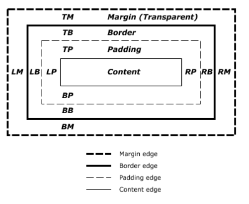
Each block element is modeled as a box.
Each box is defined by its content, padding, border and margins.
The dimensions of the box is determined by all of these.
Does this model means everything in CSS is boxes?
How can we draw triangles?
Also, what happens when two or more borders overlap?
Here's a Codepen that shows how to utilize this in order to draw a triangle.
Try setting one of the border's color to transparent.
box-sizing
To change which of the box parts are taken into account when calculating the dimentions, you can use box-sizing.
Its value can be border-box (which is the default) and content-box
By default in the CSS box model, the width and height you assign to an element is applied only to the element's content box. If the element has any border or padding, this is then added to the width and height to arrive at the size of the box that's rendered on the screen.
But when you set box-sizing to border-box the width will constrain the content, padding and border.
border-box is a lot more intuitive as a default value, that's why a lot of people include this CSS reset rule:
* {box-sizing: border-box;}
Display
In CSS, each element is either a block or an inline element (with some exceptions).
Block elements push sibling elements to the next line.
Inline elements, well, don't.
Also, you cannot set their width or height.
They simply wrap their content.
The display property controls that.
/*** The element generates a block element box,* generating line breaks both before and after* the element when in the normal flow.*/display: block;/*** The element generates one or more inline* element boxes that do not generate line* breaks before or after themselves.*/display: inline;/*** The element generates a block element* box that will be flowed with surrounding* content as if it were a single inline box.*/display: inline-block;/*** Hide the element completely*/display: none;
Positioning
This positioning technique is useful when positioning elements outside of the usual flow of the document.
The usual flow is where block elements appear in the order of where they appear in the HTML document.
This takes into account that block elements like div push elements below them, while inline elements don't.
But sometimes you want to break that flow, and position an element otherwise. This property allows you to do just that.
position: static;position: relative;position: absolute;position: fixed;position: sticky;
static
The regular position of an element according to the flow of the document.
relative
The element is positioned according to the normal flow of the document, and then offset relative to itself based on the values of:
top, right, bottom, and left.
absolute
The element is removed from the normal document flow, and no space is created for the element in the page layout. It is positioned relative to its closest positioned ancestor (anything other than static) if any; otherwise, it is placed relative to the body.
Its final position is determined by the values of top, right, bottom, and left.
fixed
The element is removed from the normal document flow, and no space is created for the element in the page layout. It is positioned relative to the body.
Its final position is determined by the values of top, right, bottom, and left.
<div class="container"></div><div class="some-element">Content</div>
.container {height:1000px;width: 200px;border: 10px solid pink;background: blue;margin: 20px;}.some-element {height: 20px;width: 20px;background: red;margin: 20px;position: fixed;top: 0;}
sticky
The element is positioned according to the normal flow of the document, and then offset relative to its nearest scrolling ancestor and containing block (nearest block-level ancestor).
body {overflow: auto;}
Flexbox
Flexbox is your best friend when writing CSS. I do 99% of the positining on screen using it.
Unlike the position property, flexbox doesn't remove elements from the flow of the document, but rather re-arranges them within the flexbox container.
The elements in that container will still push elements outside it and interact with them.
There are a ton of flexbox resources that will do a better job that I will, so here they are:
CSS Variables
You can set variables in CSS.
Each variable can be referenced in elements that are a child of the one its defined in.
In order for them be global, you can use the :root selector.
:root {--my-color: pink;--animation-speed: 0.3s;}.some-class {--my-color: blue;color: var(--my-color);animation: some-animation var(--animation-speed)}
Pseudo Elements
Not every element on a page needs to be defined in the HTML.
For things that are used mainly for representational purposes, you can use pseudo elements: here's a Codpen example.
div::before {content: "";display: block;}div::after {/* ... */}
Besides ::before and ::after, there are many more, like the ::marker element which is responsible for displaying the · in unordered lists (ul).
Read more about them in MDN.
The rest of this, are just things to make you want to learn more CSS.
Animations
There are 2 ways to animate in CSS.
https://codepen.io/dlvhdr/pen/eYGoRJq
- The
transitionproperty - Using the
animationproperty which gives you finer control over the steps
Media queries
In order to have your website display well on all kinds of devices, you should use media queries.
Of course there are more use cases like setting the preferred color scheme (light or dark) and reducing animations for people who prefer to have them reduced.
https://codepen.io/dlvhdr/pen/RwLOydX
Basic syntax, where media-type can be:
allprintscreen
@media media-type and (media-feature-rule) {/* CSS rules go here */}
Programming with CSS
You can even use CSS to add behavior, instead of Javascript.
CSS checkboxes can be used for state
input[type=checkbox]:checked {...}
Pseudo classes can be used to add even more functionality.
Emmet
Emmet can make you code CSS (and HTML) much faster.
See this YouTube video by Web Dev Simplified.
Awesome CSS resources
- MDN!
- 100 Days of CSS
- CSS Battle
- Everything by Amit Sheen
- Awesome CSS on GitHub
More learning resources
- Specificity: https://developer.mozilla.org/en-US/docs/Web/CSS/Specificity#how_is_specificity_calculated
- CSS Selectors: https://flukeout.github.io/
- Selectors List: https://www.w3.org/TR/selectors-3/#selectors
- Box model: https://www.w3.org/TR/CSS2/box.html
- Flexbox: https://css-tricks.com/snippets/css/a-guide-to-flexbox/
- Grid: https://css-tricks.com/snippets/css/complete-guide-grid/